Google just released Gemini 3 last week, and it blew some people away on Twitter and Reddit with how good it is at reasoning, output reliability, and vibe coding, all while using fewer tokens and less time.
I use v0 for building modern web apps and Cursor and Claude for everything else. However, what blew me away the most is how much Gemini has improved when it comes to UI and design output, even with zero-shot prompting for complex animations:
Example 1: Interactive vector field simulation Example 2: AI assistant, retro-inspiredSo, I decided to put Gemini 3 Pro (Preview) and Gemini 2.5 Pro models to the test using zero-shot prompting (except for #5). We’re going to vibe code using the prompts below without doing any further editing, then we’ll evaluate the results.
For this comparison, we will use Google AI Studio. It’s a unified playground where you can test Google’s AI models for free.
We’re going to test the models across five key criteria:
- Layouts: Handle complex responsive structures for an admin dashboard with Tailwind CSS
- Components: Generate reusable React components for a Pricing Page
- Interactions & Animations: Make the components interactive and animate them
- Code Quality: Evaluate if the code adheres to TypeScript and Next.js best practices
- Image to Code: Convert existing visual designs into functional code
Let’s begin!
1. Layouts
Layouts are the foundation of any modern, responsive, and dynamic UI. So, this is the first thing we want to put to the test. Let’s task our models to create a dashboard layout featuring a responsive grid, a collapsible sidebar, and a sticky header using Tailwind CSS.
Prompt
Create a responsive Next.js dashboard layout using Tailwind CSS. Requirements:
- Collapsible sidebar navigation (hidden on mobile, drawer on click).
- Sticky top header with search bar.
- Main content area with a responsive grid (1 col mobile, 2 col tablet, 3 col desktop).
- Use semantic HTML tags (
<main>,<aside>,<header>).
Gemini 2.5 Pro
Gemini 2.5 Pro provides a solid foundation. It correctly uses Flexbox and Grid utils. However, the look and feel reminded me of the admin dashboard layouts I used to build with Bootstrap. Last, the sidebar looks basic, and it occupies the entire screen when expanded on mobile, meaning you can’t close it by tapping outside the drawer.
Gemini 3 Pro
Gemini 3 Pro just gets it. It understands modern CSS structure better, using Tailwind’s arbitrary values and calc() functions instead of hardcoding everything. Also, the UI feels much more polished and modern than Gemini 2.5 Pro’s.
Winner: Gemini 3 Pro for producing a more responsive, structured, scalable, and modern layout.
2. Components
We want components that are composable, reusable, and maintainable.
In this test, we’ll task the LLM models with creating a reusable “Pricing Card” component, commonly used in web apps that integrate with subscription services to unlock premium features.
Prompt
Generate a reusable
PricingCardcomponent in React/Next.js with Tailwind CSS. Props:title,price,features(array),isPopular(boolean). Features:
- If
isPopularis true, show a ‘Most Popular’ badge and a highlighted border.- Map through features and display them with checkmark icons.
- Use
clsxortailwind-mergefor conditional class handling.- Strict TypeScript typing.
Gemini 2.5 Pro
Gemini 2.5 Pro gave me a working pricing card, but the code structure wasn’t great. It used template literals for classes instead of the requested clsx and tailwind-merge. Last, it added a basic hover state for the button, but missed the hover effects for the card itself.
Gemini 3 Pro
Gemini 3 Pro nailed the requirements and even added a toggle for monthly/yearly pricing—something I didn’t explicitly ask for but definitely wanted. It also correctly used clsx and tailwind-merge for cleaner class management. The interactions were spot on, too, with subtle, polished hover animations for both the card and the call-to-action.
Winner: Gemini 3 Pro takes this round by following the instructions, adhering to strict TypeScript requirements, and going beyond the scope of the prompt.
3. Interactions & Animations
Subtle animations make apps feel alive and more personalize so as long as you are intentional with the amount of animations you add.
In this test, we’ll test if the models could handle a ‘Swipe to Delete’ interaction using Framer Motion, focusing on how the animation actually feels.
The Prompt: “Create a ‘Swipe to Delete’ list item component using Framer Motion in Next.js. Requirements:
- User can drag the item left to reveal a red ‘Delete’ background.
- If dragged past a threshold, trigger a delete callback.
- Animate the height of the item to 0 after deletion to smooth out the list layout.
- Ensure it works on touch devices.”
Gemini 2.5 Pro
Gemini 2.5 Pro generated a swipeable list item component using Framer Motion in Next.js. However, the most obvious mistake here is that there is no delete icon when the swipable card reveals the action. Lastly, the swipe animation felt a little rigid, and the delete animation was a bit abrupt and not smooth.
Gemini 3 Pro
Gemini 3 Pro produced an output with a better user experience, as shown below. It included tactile feedback, such as a bounce effect on click, refined hover states, and a fluid exit animation for deleted items.
Lastly, it went beyond the prompt’s scope by including an ‘Add Item’ feature and a ‘Dream’ button to simulate AI-generated content.
Winner: While both met the requirement to use Framer Motion, Gemini 3 Pro wins for delivering a more polished user experience and for going beyond the prompt’s scope with creative, functional additions.
4. Code Quality
Generating code with AI sounds like magic if you were to ask me ages ago. However, great apps should not only be judged by how it looks. If the code is messy, it’s just creating more work for teams to refactor, maintain, and scale. Let’s look at the code quality from the tests above.
4.1 Layouts: Modern CSS vs. Legacy Patterns
Gemini 2.5 Pro gave me a functional layout, but the code felt dated. Also, Gemini 2.5 Pro tightly coupled most of the layout logic within the component:
// Gemini 2.5 Pro - Sidebar.tsx
const Sidebar: React.FC<SidebarProps> = ({ ... }) => {
  // Defining sub-components inside the parent is a performance anti-pattern
  const NavItem = ({ icon, text }: { ... }) => ( ... );

  return (
    <aside className={`... ${isSidebarOpen ? 'translate-x-0' : '-translate-x-full'}`}>
      {/* ... */}
    </aside>
  );
};

// Other components
Gemini 3 Pro used a cleaner “Layout” pattern, separating the shell (Sidebar/Header) from the page content:
// Gemini 3 Pro - Layout.tsx
import React, { useState, ReactNode } from 'react';
import { Sidebar } from './Sidebar';
import { Header } from './Header';
import { DashboardView } from '../types';

interface LayoutProps {
  children: ReactNode;
  currentView: DashboardView;
  onViewChange: (view: DashboardView) => void;
}

export const Layout: React.FC<LayoutProps> = ({ children, currentView, onViewChange }) => {
  const [isSidebarOpen, setIsSidebarOpen] = useState(false);

  const toggleSidebar = () => setIsSidebarOpen(!isSidebarOpen);
  const closeSidebar = () => setIsSidebarOpen(false);
}
Gemini 3 Pro also modularised the code much better by creating dedicated state management for components, and went further by using modern libraries like lucide-react and recharts:
// Gemini 3 Pro - Sidebar.tsx
import React from 'react';
import { LayoutDashboard, BarChart3, Users, Settings, X, Box } from 'lucide-react';
import { DashboardView, NavItem } from '../types';

interface SidebarProps {
  isOpen: boolean;
  onClose: () => void;
  currentView: DashboardView;
  onViewChange: (view: DashboardView) => void;
}

export const Sidebar: React.FC<SidebarProps> = ({ isOpen, onClose, currentView, onViewChange }) => {
  const navItems: NavItem[] = [
    { id: DashboardView.OVERVIEW, label: 'Overview', icon: <LayoutDashboard size={20} /> },
    { id: DashboardView.ANALYTICS, label: 'Analytics', icon: <BarChart3 size={20} /> },
    { id: DashboardView.CUSTOMERS, label: 'Customers', icon: <Users size={20} /> },
    { id: DashboardView.SETTINGS, label: 'Settings', icon: <Settings size={20} /> },
  ];
}
Folder Structure Comparison
Gemini 3 Pro has separated the layout and component logic into separate files. It created files for types and reusable components (StatCard, ChartWidget), whereas Gemini 2.5 Pro kept things more monolithic:
Gemini 2.5 Pro                  Gemini 3 Pro
├── components/                 ├── components/
│   ├── icons/                  │   ├── ChartWidget.tsx
│   │   └── HeroIcons.tsx       │   ├── Dashboard.tsx
│   ├── Dashboard.tsx           │   ├── Header.tsx
│   ├── Header.tsx              │   ├── Layout.tsx
│   └── Sidebar.tsx             │   ├── Sidebar.tsx
└── App.tsx                     │   └── StatCard.tsx
                                ├── types.ts
                                └── App.tsx
4.2 Components: Conditional Logic & Maintainability
This was an obvious difference during the test. I explicitly asked both models to handle conditional styling for the “Popular” state using clsx and tailwind-merge. Gemini 2.5 Pro completely ignored this.
Gemini 2.5 Pro relied on template literals. While valid, this approach is prone to specificity conflicts and becomes unreadable as complexity grows:
// Gemini 2.5 Pro - PricingCard.tsx

import React from 'react';
import { CheckIcon } from './icons/CheckIcon';

(...)

const cardClasses = `
  flex flex-col bg-white rounded-xl shadow-lg transition-transform duration-300
  ${isPopular ? 'border-2 border-indigo-500 scale-105' : 'border border-slate-200'}
`;

const buttonClasses = `
  w-full py-3 px-6 rounded-lg font-semibold text-center transition-all duration-300
  ${
    isPopular
      ? 'bg-indigo-500 text-white hover:bg-indigo-600 shadow-indigo-300/50 shadow-lg'
      : 'bg-white text-indigo-500 border-2 border-indigo-200 hover:bg-indigo-50 hover:border-indigo-500'
  }
`;

(...)
Gemini 3 Pro created a custom cn utility function, that implements the use of clsx and tailwind-merge libraries:
// lib/utils.ts

import { type ClassValue, clsx } from 'clsx';
import { twMerge } from 'tailwind-merge';

/**
 * Merges Tailwind CSS classes safely, handling conflicts.
 */
export function cn(...inputs: ClassValue[]) {
  return twMerge(clsx(inputs));
}
Then, the custom utility function cn is used to make the class management more maintainable and readable:
// Gemini 3 Pro - PricingCard.tsx

import React from 'react';
import { Check } from 'lucide-react';
import { cn } from '../lib/utils';

(...)

<div
className={cn(
  "relative flex flex-col rounded-2xl border bg-white p-6 shadow-sm transition-all duration-300 hover:shadow-lg xl:p-8",
  isPopular
    ? "border-primary-600 ring-1 ring-primary-600 scale-[1.02] lg:scale-105 z-10"
    : "border-gray-200 hover:border-primary-200",
  className
)}
>


{isPopular && (
  <div className="absolute -top-4 left-0 right-0 flex justify-center">
    <span className="rounded-full bg-primary-600 px-3 py-1 text-xs font-semibold uppercase tracking-wide text-white shadow-sm">
      Most Popular
    </span>
  </div>
)}
4.3 Interactions: Framer Motion Implementation
For the swipeable list, we asked both models to create a todo list with a “Swipe to Delete” component. This requires careful handling of gesture state, layout animations, and user feedback.
Gemini 2.5 Pro gave me a functional but basic implementation. It used useMotionValue and useTransform, but the interaction felt rigid. Gemini 2.5 Pro’s output lacked visual feedback during hover, drag (eg. “will delete state”), and the exit animation was abrupt:
// Gemini 2.5 Pro
export const SwipeToDeleteItem: React.FC<SwipeToDeleteItemProps> = ({ item, onDelete }) => {
  const x = useMotionValue(0);
  // ... basic transform logic

  return (
    <motion.li
      layout
      // ... basic exit props
      exit={{ height: 0, opacity: 0, borderTopWidth: 0, borderBottomWidth: 0, marginTop: 0, marginBottom: 0 }}
    >
       {/* ... content */}
    </motion.li>
  );
};
Gemini 3 Pro showed a much-polished user experience during implementation. It added state-driven feedback and micro-interactions when I hovered over an item. Also, the tactile feel helps enhance the feel as I try to delete the item. Lastly, the exit animation is much smoother and less abrupt:
// Gemini 3 Pro
const SwipeableItem: React.FC<SwipeableItemProps> = ({ item, onDelete }) => {
  // Track if we are past the delete threshold to provide visual feedback
  const [willDelete, setWillDelete] = useState(false);

  // ...

  return (
    <motion.div
      layout
      // ... polished exit props
      exit={{
        opacity: 0,
        height: 0,
        marginBottom: 0,
        transition: { duration: 0.3, ease: "easeInOut" }
      }}
    >
      {/* Background Layer with state-driven color */}
      <motion.div
        className={`... transition-colors duration-200 ${
          willDelete ? 'bg-red-600' : 'bg-red-500'
        }`}
      >
        {/* ... */}
      </motion.div>

      {/* Foreground Layer with tactile feedback */}
      <motion.div
        drag="x"
        dragElastic={{ left: 0.7, right: 0.1 }} // Resistance feeling
        whileTap={{ scale: 0.98 }} // Tactile press
        // ...
      >
        {/* ... */}
      </motion.div>
    </motion.div>
  );
};
5. Image to Code
Lastly, for this comparison test, we will assess the models’ ability to generate UI from an image and evaluate how closely the generated code matches the original design.
Zero-shot vs one-shot prompting: In previous tests, we have used zero-shot prompting, where we give instructions to the models without prior examples. Now, we will use a prompt technique called one-shot prompting, in which we provide the model with a screenshot of the app and ask it to generate functional code.
Why is this an important test? Multimodal capabilities are essential for frontend development. We often start with a screenshot or a Figma design and need to convert it to code. I also use tools like Figma MCP to streamline my workflow.
Prompt
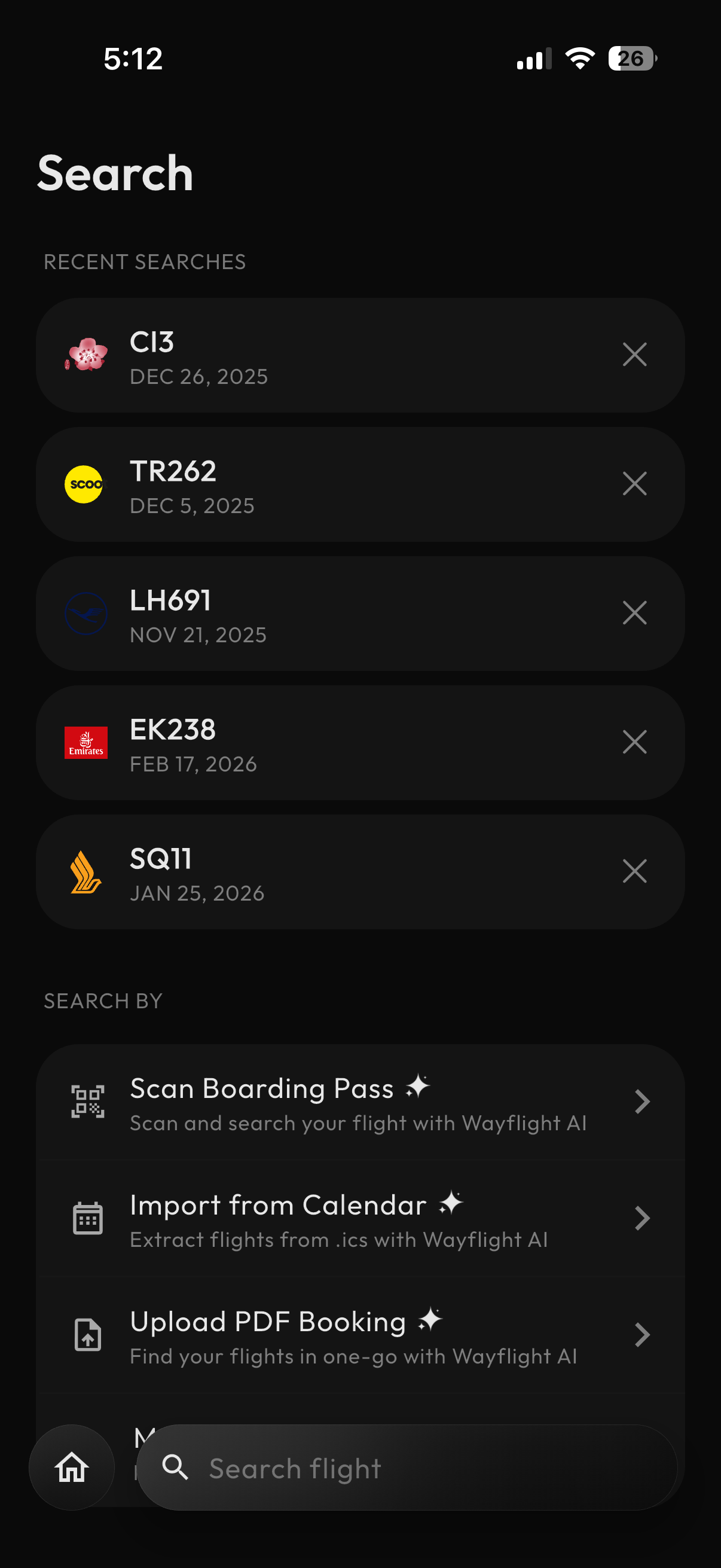
Let’s convert a flight tracking app screen into code. You can use this screenshot as a reference (Right Click > Save Image As...):
System Instruction: You are an expert frontend engineer.
User: Convert the manually created mobile UI design into a responsive Next.js site.
Requirements:
- Visual Fidelity: Pay close attention to spacing, typography (weights, sizes, colors), border radius, and shadows.
- Icons: Use
lucide-reactfor airline icons.- Colors: Match the colors from the airline logos instead of fetching actual airline logos online.
- Responsiveness: Ensure it adapts gracefully to smaller screens.
Visual Comparison
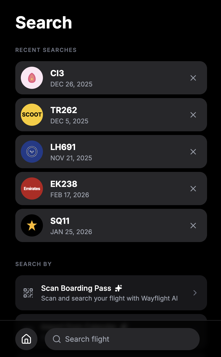
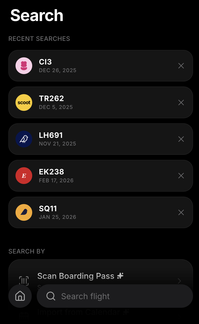
Gemini 3 Pro does a much better job matching the colors, layout, spacing, and shadows here. However, I like that Gemini 2.5 Pro did not add unnecessary borders to the cards.
| Gemini 2.5 Pro | Gemini 3 Pro |
|---|---|
 |  |
Interaction Details
Hover & Scroll Actions
Gemini 3 Pro added hover animations on the cards, while Gemini 2.5 Pro remained static. Also, scrolling on Gemini 3 Pro’s output looks more polished: its content scrolls behind the bottom navigation with a gradient overlay.
| Gemini 2.5 Pro | Gemini 3 Pro |
|---|---|
Click & Delete Action
The subtle click feedback in Gemini 3 Pro’s output provides a better feel for users. This is on top of the smooth exit animation when removing a recent search item. Lastly, the empty state is properly handled in Gemini 3 Pro, showing off a “No recent search” message.
| Gemini 2.5 Pro | Gemini 3 Pro |
|---|---|
Winner: Gemini 3 Pro demonstrates a really good visual understanding here. It translates pixels to code with reliable accuracy. I don’t think it’s perfect or going to be 100% accurate, but having the output as close as possible to the reference design is good enough to reduce the time it takes to refactor and polish the code.
The takeaway
Gemini 3 Pro is the clear winner here. Gemini 2.5 Pro outputs a look and feel similar to Bootstrap or Material Design that required more time to polish, especially when matching a specific product and brand identity. While Gemini 2.5 Pro remains a capable LLM model, I find Gemini 3 Pro a really solid upgrade.
Let’s keep it real, Gemini 3 Pro will not make you a 10x developer without an investment on your part. Continue to improve your fundamental knowledge in the programming language or tools of your choice and excel in your domain expertise or industry.
—Joshua